

For those who haven’t come across these terms before, you might be wondering what is the buzz about these two terminologies: Mobile-first and Responsive web design? Knowing what they are could mean changing your digital strategy for 2022 based on what you know about your potential customers.
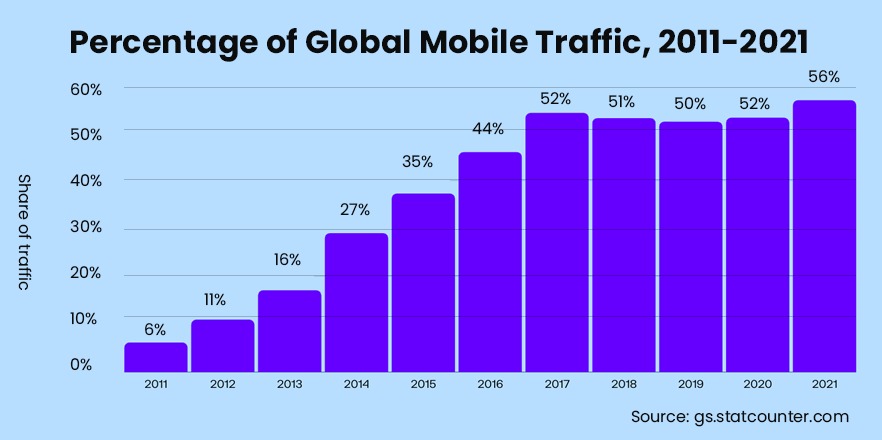
Before diving deeper into these concepts, let me present you with a couple of stats about the trends in web design and development. Take a look around you, if you are out in public, you will see most folks fixated on the little glowing screens of their smartphones.
Half of the world’s internet users (approximately 2 billion) browse their web through smartphones. Many of them might not even have a laptop, desktop, or even tablet.
Mobile usage vs desktop usage comparison also shows that 58% of online purchases happen on mobile devices. (Source: Merchant Savvy)
Most users in the world are dependent on their mobile phones and so it becomes crucial for a business to know its audience. To ensure your business’s long-term success, you might need to design a website that is mobile-first and not just mobile-friendly. With that being said, it’s time to dig deeper into these 2 terms – believe me, they are very distinctive.
What is a responsive web design and why it’s not yet passe?
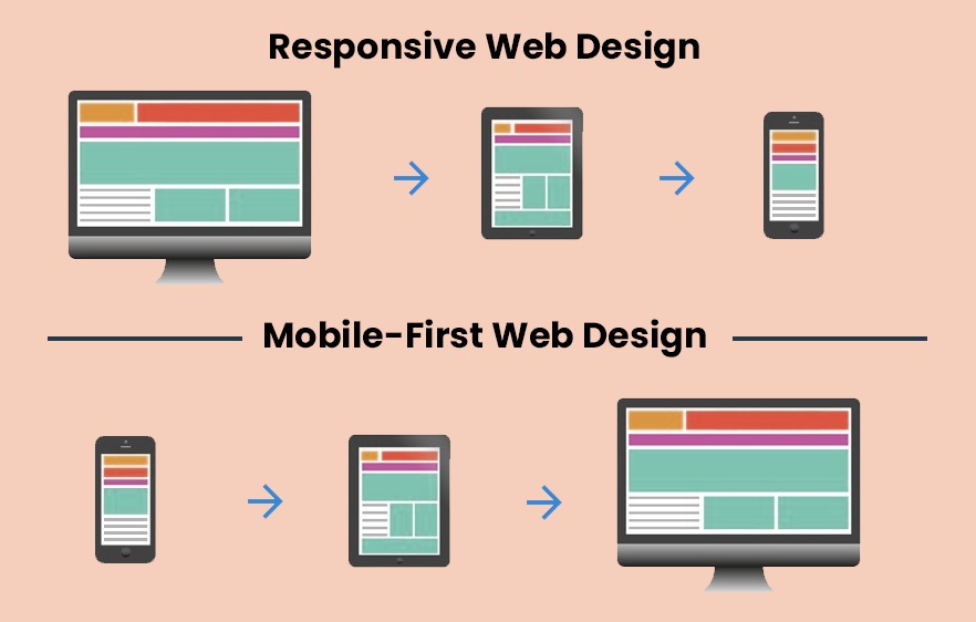
In simple terms, a responsive design means to design a website for the desktop first and then adjust it to smaller screens such as a mobile or tablet. This style of design became popular in 2015 when people still preferred their desktops rather than smartphones to browse the web.
It is beneficial for many businesses whose users access information mostly through desktops or laptops, to continue to design a website that is responsive rather than mobile-first. This is true particularly for businesses in the B2B space. Such organizations should continue their focus on having websites that follow responsive design principles.
Responsive web design uses what is known as a ‘fluid grid’. It shrinks font sizes and moves elements into a single column when the screen size reduces, as in the case of a mobile device.
What is a mobile-first website and why we will see more of it in future?
The term “mobile-first” was coined by Eric Schmidt, while the idea of designing a website specifically for mobile users was put forward by “Luke Wroblewski.” Mobile-first design means designing the website for mobile devices first and then scaling it upward to fit the larger screens – it’s a progressive advancement. So that makes it exactly opposite to the design principle of responsive websites, which is also known as graceful degradation.
Mobile-first website focuses on the useful elements that will provide value to your target audience and thereby removing unnecessary clutter that is not relevant.
Many companies are using the mobile-first design approach. For example, Instagram started with the mobile-first approach by first designing an Instagram app using mobile phones and then scaling it up to a desktop version. You can only make a post through the app through and the desktop version only allows for browsing.
Also read: 4 Mobile App Design Trends That will Continue Into Future
3 Reasons why your business needs a mobile-first design website
1.Starting in July 2019, Google moved to mobile-first indexing. This means that the Google search algorithms look at the content of the mobile version of the site to index and rank it in search results. This is a reflection of the crazy increase in mobile traffic every year.
According to Statista, the mobile share of organic search engine results accounted for 61% in the second quarter of 2021 in the US.
So, in short, if you are not focusing on providing the best mobile experience to your visitors, they might head over to your competitors. Users have many options before them and that’s why the latest trends in website design and development have businesses looking into keeping their mobile visitors happy.
2. Mobile-first websites focus on providing the best user experience. Well, you might wonder don’t all websites have that goal? When developers work with smaller screens, they must prioritize the most important aspects of the product or service. This translates to a functionally superior layout that is designed for touch rather than the desk-top click. For instance, there will be more interactive buttons rather than text links.
3. Finally, there is more money to be made on the mobile. That’s why the importance of mobile-first design is borne out by the fact that more companies advertise via smartphones compared to other channels like T.V or print. Social media sponsored ads usually have delightful animations and we know that media consumption is highest on mobile devices and ergo clicks on mobile ads drive higher traffic to websites.
3 mobile-first design principles
Here are the 3 top tips that must be kept in mind when designing your mobile-first website.
Keep your website simple
In mobile-first design content is key but that doesn’t mean cluttering up information. Rather, give your users the content that is absolutely essential and ruthlessly cut out the fluff. Your design must make a user solve a problem quickly or complete a task in the shortest possible time.
Add bright, bold and consistent CTAs
Whenever you create a mobile-first website, use larger fonts and make the call-to-action buttons easily respond to touch. Utilize white space around buttons so that users can easily carry out an action. Mobile visitors are using their fingers to perform specific actions on their smaller screens, and if the content and buttons are not spaced out, and if the page is not readable, they might bounce from your site. This is because when an expected action does not happen quickly, users get frustrated and leave.
Have a thumb-friendly navigation
One of the most crucial steps is defining the navigation bar on the mobile-first site. Most desktop sites have extensive navigation but this does not suit a mobile-first design as it takes too much space. Instead, you can use the hamburger menu that will hide the navigation links. Recall the 3 horizontal lines at the top of the screen that drops down on touch, to show more navigational links – this is the hamburger menu. Finally, the navigation menu and CTAs should be positioned where the thumb can easily reach them.
If you are still not sure whether you could benefit from revamping your existing website to a mobile-first design, let’s talk. Our team of experts will answer all your questions, even have a look at your existing visitor analytics, and then advise you whether a mobile-first strategy would be best for your business.


