

SEO or search engine optimization can be a technical maze but every website must have it. Most businesses, small or big, might have an in-house team but usually prefer to hire professional SEO services. In the latter instance, how do you make sure that the SEO company you partner with is best for your business?
Businesses spend a lot on developing a good website and feel the work is done. It is like dressing up in your best outfit and then sitting in front of your idiot box with nothing else to do. Visits from search engines should contribute to at least 60% of overall traffic. But If your monthly traffic is just a couple of hundreds then your website is in a bad place and you need SEO help. More the traffic, the better the brand visibility, and the higher the conversion.
Among the numerous SEO companies out there how do you find a credible agency? Keep in mind, the best SEO company is subjective and depends on the goals you have. It is NOT “I want more leads”. If you get the traffic and if you have good conversion points on your website, leads will come in. So, how do you choose an SEO service, and more importantly, how do you stay away from “Black Hat SEO” agencies – these are the hyenas of the SEO world.
Stay clear of over-promising SEO agencies
As a business, you might not be familiar with the technicalities of SEO, in fact, many businesses find themselves in this boat. It is important that you still be able to identify a credible SEO agency from a scam. A bad SEO agency is one that uses fraudulent means (called Black Hat SEO) to increase traffic in a short span of time. It will harm your brand and can get your website penalized by search engines such as Google. Here is how to spot an over-promising SEO company.
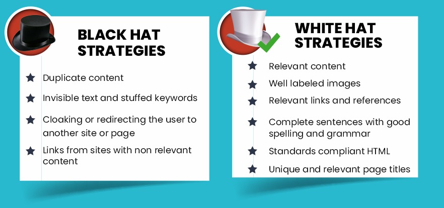
Promising increase in traffic in a short time: Such ‘SEO experts’ will get you traffic in underhand ways. For example, showing unrelated content to users and redirecting them instead to your website. These link schemes or misleading redirects can bring traffic to your website but they will bounce. A high bounce rate tells Google that your site is not a quality site. You will see your organic traffic drop but it will be too late and very expensive to recover. There are many other tricks that Black Hat SEO companies do to get quick traffic.
If the SEO company you are considering hiring is offering you a guaranteed #1 ranking on Google Search – it’s time you run. It is a scam so don’t fall for it. Search engines like Google use over 200 ranking factors and no SEO company has a special relationship with Google to guarantee you results. It takes a lot of sustained work to get keywords on the first page of the search. The best SEO companies will guarantee you better results but they will also be transparent about the ways to achieve it.
Also Read: Your Website without SEO is Like That Top End Car without Fuel
How to choose the best SEO company for your business
If you are no expert when it comes to SEO, it’s okay, the SEO agency you hire should be. Of course, you need to know you are choosing one that will give you results. This means that you need to know just enough, to identify a credible SEO partner.
Industry reputation is a fine thing to have and if your SEO experts have known brand names as clients, well and good. Oftentimes, such branded digital marketing companies come at a cost that might be too high for your marketing budget. There are always other good SEO companies that have the expertise that would suit you. A reference from someone who has used their services would be helpful.
The next step is getting a site audit, irrespective If you do a Google search to find an SEO company, contact a known brand or get a reference. Never skip this step, as it is a good way to judge what the company can bring to the table and how well they understand your industry. Most businesses don’t realize that they can ask for a site audit at the outset. While most SEO agencies will not give you a full audit (since you have not signed up with them yet) the limited analysis they give you should be more than enough to judge their capability.
Also Read: What should be the cost of your Website Redesign
Some companies that call themselves SEO experts will not have access to paid SEO tools like Ahrefs, SEOMoz, or Ubersuggest among the many. Make sure you ask them what tools they have used to give you the site audit. Without access to paid SEO tools, there is no way they can do competitor analysis. Often a site audit on free tools like seooptimizer.com (try it) is what they will do. It is a dead giveaway that this company will not be the best one to choose. Further, the exact search volume for keywords you want your site to rank for can only be found on Google Paid Ad tools like Google Keyword Planner. An SEO agency cannot get access to the Google Keyword Planner unless they are also running paid advertisements for clients. This is an important criterion when choosing an SEO expert. As you can see, a lot of tools are connected to get a proper analysis.
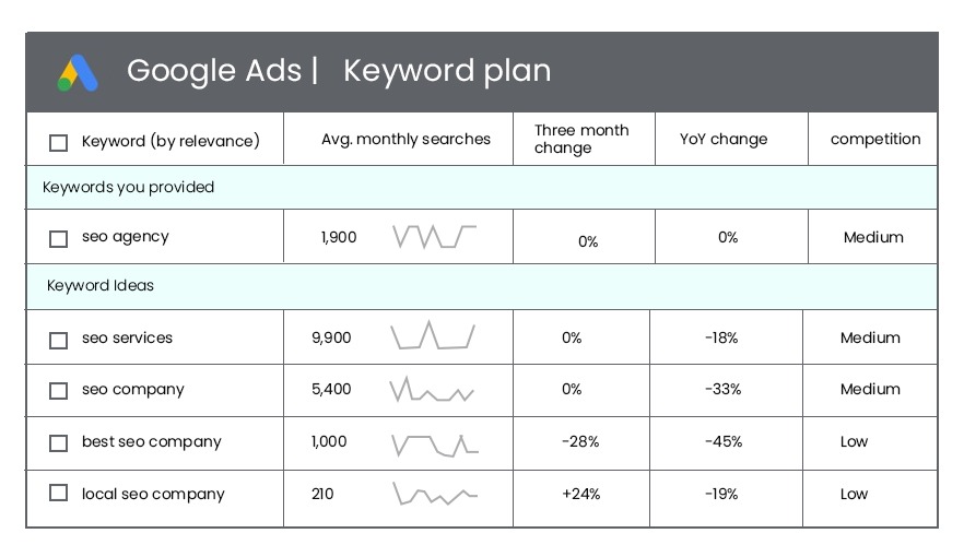
I mentioned competitor analysis, your competitor may not be whom you have identified in the physical world. For instance, if you are selling perfumes, competition for your shop is not other perfume shops. In the digital space, it is probably Amazon, Nykaa, and other e-commerce sites. In fact, your competition is any business that is coming on the first page of Google search results for the keywords that you want your business to be ranked for. Only paid SEO tools will give these insights.
An SEO agency should have multiple specialists working on your business account for search engine optimization. At a minimum there should be a content writer, a keyword specialist for on-page SEO and technical SEO, the third should be a backlink specialist. A backlink specialist gets other sites to link to your website and thus increases the credibility of your site. Never pay for backlinks, there is a special strategy for it.
Most important though is that everyone on the SEO team have a fairly good command of the English language, or whichever language your site uses. This is the biggest problem among Indian SEO agencies. Most SEO specialists only understand keywords and all the rest of the content on the webpage is hidden to them. Stuffing a page with keywords is not a good approach. Google looks at how good the content is for a visitor based on time spent on the page. This is why your SEO team should have a content writer on it.
Finally. An SEO agency should have the confidence to guarantee results (not ranking on page 1 of search) in how much traffic they can provide you in 3 months, 6 months, a year. Think about it like this, you both need to know where you are going and the milestones on the way., else you will not know if you have succeeded or not.