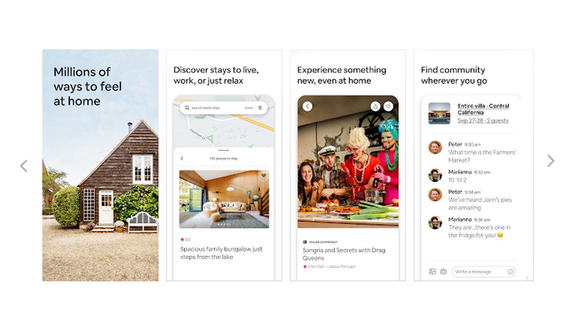
Mobile apps have to provide users with great “I-want” moments. Anything less and the user will abandon the app. This is a real time worry for many app owners and developers as desktop versions are increasingly becoming a secondary touchpoint with digital audiences preferring apps to get things done quicker and easier. For an app developer it is essential to know how the UI and UX in app design can improve functionality.
App developers pick up UX best practices through the course of their careers. Instead of learning through trial and error, here are 5 fundamentals to app UX best practices that is good to know, right off the bat.
1. Start with a minimalistic design
The biggest pitfall developers often make is designing to showcase their abilities rather than designing for their target audience. User interface and user experience balanced with functionality are the keystones for an effective app.
Overuse of colours and too many bells and whistles, take away from the main idea – that one thing you need your audience to do. Too much happening on the screen and it gets to be a cognitive overload for the user. Every extra bit of information, button, image or icon makes user flow more complicated.
When designing keep to this
- Bring simplicity to app design. White space is good.
- Never overload with too many colours or fancy icons. It’s a distraction
- Not more than 1 or 2 actions in each screen.
- Remove any obstacles on a straight path to goal completion
- Headline text must be concise to fit the screen resolution
- Purpose driven content only. Add content if it aids goal conversion.

Also read:
How to arrive at a realistic mobile app development timeline
2. Avoid visual saturation, balance is the mantra
Colours talk! Really, they do. App designers must understand what each colour means and the reactions they evoke in a user. Colours subconsciously influence the mind and understanding the psychology of colour is a must. The best designed apps set the mood and user expectation with choice of colour. The right colour scheme can convey youthful exuberance or high-end elegance or tranquillity.
You might be limited by brand colours but there are good tools out there to choose your colour palette. A few of them like coolors.co or paletton.com are useful if you have a primary colour and want to pick additional colour tones.
App design can include up to 3 colours but whatever be the temptation, avoid using more than 3. If you must, then go for shades or tints of your 3-colour palette. To balance the colours, use the interior design rule of 60-3-10
For colour balance, stick to the interior design formula for each screen:
60% Primary Colour + 30% Secondary Colour + 10% Accent Colour
3. Use animation wisely but well for user engagement
Nothing is stationary around us so why have an app without some movement? Applied thoughtfully, it can make transitions and interactions more dynamic and therefore more intuitive. Very often, so much time goes into the functionality that developers forget that there is a fine line between boring and interesting.
Animation does not require to be out-of-the-box thinking but do remember that motion on purpose does not require reinventing the wheel. Here are a few ways to keep app animation simple but effective:
- Use animation to indicate when a process is progressing or ended
- Draw attention to a specific element (but keep to only 1 action on a screen)
- Animated pop-up notifications, feedback animations, onboarding animations, navigation animations make your app appear dynamic and fast.

Also Read:
Top 5 tips to reduce the hidden costs of developing an app
4. User friendly in-app search design
Smaller screens and smaller virtual keyboards make mobile search very different from the desktop but even more important.
The app UX best practices must decide on the prominence of search based on app purpose. User behaviour on the app depends on the purpose of the app. If users want to buy something then the search feature must be prominent, navigation through links might not be enough. If the user comes to the mobile app for information then the search does not necessarily need be the hero. Based on the purpose, a good UX will decide on what position search must take.
- A full-length search bar below the menu, if users need quick access to a lot of content
- If search is not the full focus then use Tab bar search that occupies less space
- Contextual search icon is used often but is a trade-off between having a search but not expecting it to be used much.
Of course, good search design and functionality go hand in hand. It is always recommended to show instant results with each keystroke. Search terms are a good insight into your audience needs. Are you fulfilling it?
5. Error handling and action confirmations
Tech glitches are far too common. Apps that don’t handle it well are going to leave users with a negative impression. In fact, this is often overlooked or added on as an after thought right than built into the UX.
If you fail to include confirmation after a user has completed an action or explain the next steps if an action could not be completed, then you will have a frustrated user.
A few practical ways to avoid mistake in error handling
- Create a list of all actions a user can do on the app then add confirmation and error messages
- When you complete the prototype, run through the list to ensure all test cases are handled.
- Confirmation can be a pop-up message or even a change in colour
Creating an ideal user experience while still meeting business goals is never easy. However, if you follow these 5 UX best practices, the probability is high that you have created an engaging app that is also profitable.
If you want to improve your mobile app UX or planning on developing an app, don’t hesitate to contact us or drop us a message in the chat here.


