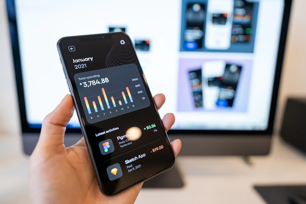
Like fashion trends, mobile app design trends are one day in fashion and the next year out. For instance, in 2012 and a few years after, a flat design was popular but today it is all about minimalism. Keeping up with the latest mobile app design trends is all the more important because in order of importance for an app, first comes functionality, and then comes app design. Without these two, an app is never going to succeed.
4 Latest Mobile App Design Trends in 2025
Just like retro is coming back in fashion (think wide-legged jeans) so apps might still borrow design styles from the past but are giving it a modern twist. Here is what all app designers and developers must know when they begin on a new app, to keep it future ready
1. Neumorphism in UI interfaces
At the start, when smartphones and laptops were just beginning to take off, app design was still in its infancy and so the trend was to imitate real-world objects. After all, we were novices to technology,: users and developers alike. For example, a calendar, a calculator or a recycle bin actually looked like their real-world counterparts and helped us intuitively understand their function. This is Skeuomorphism.
We are no longer newbies now and design has evolved to Neumorphism. This design trend took off in 2020 and has added on newer elements and versions and does look as though it will stay strong for now.
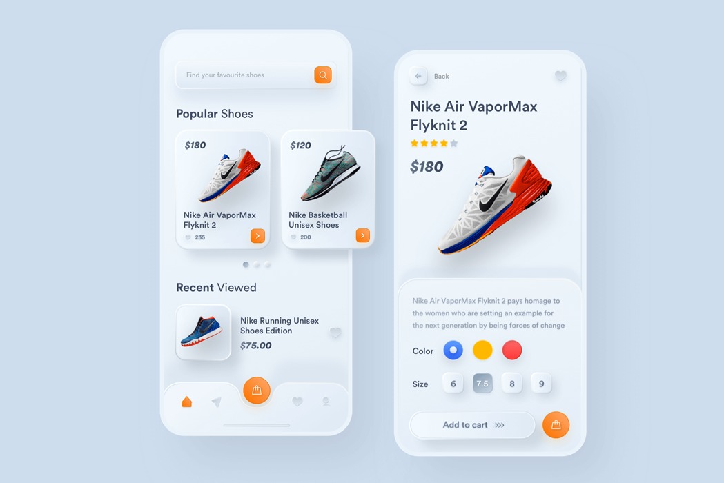
The neuromorphic design uses multiple box-shadows and background color values to bring a floating effect to elements on both a website and mobile app. Variations of shadows give it a distinctive ‘soft’ visual design. These effects are wholly created through HTML and CSS using gradients, fill, stroke, and even inner shadows through natural code.
The advantage of neumorphic design for apps is that users almost feel able to reach out and expect to feel the object, an almost real-life experience. To understand why app developers love it so much, have a look at the Nike app below. You feel as though you can reach out and take the shoe. It is the craziest feeling and why it is growing in popularity.
2. Super minimalism to prevent eye fatigue
A survey this year by Statistica Research shows that an average person in the United States spends 5.4 hours each day on their mobile devices. That’s a lot of time glued to a small screen, no wonder then that users are craving for a more comfortable viewing experience.
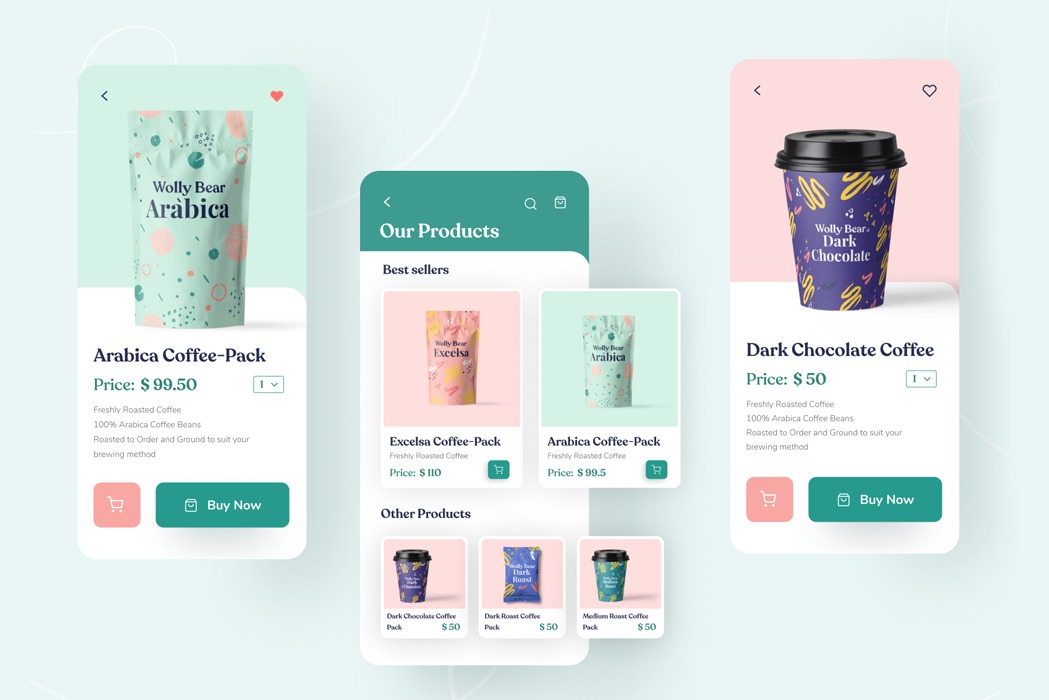
Frenzied fonts and busy graphics have given way to a clean and clear minimalistic design. Minimalism is all about emphasizing the content of the app and let design be a quiet supporting force. This is a tough ask for many app designers as they try to restrain themselves from overloading an app or website with design delights.
Ensure that your app during the design phase follows the app design trend of stripping back everything that creates a distraction. A super-minimalistic design will do “one job at a time” and be easy to use. The mantra must be “less is more”, so keep asking the question ”do we need this?”
The Wolly Bear Coffee app by Swathi Nirwal is a good example of super-minimalism. The visual impact it creates shows why this app design trend is here to stay. Soft drop shadow effect, prominent buttons and easily readable fonts explain why a product-oriented design creates a user-friendly experience.
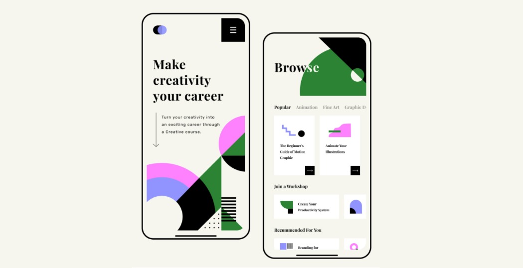
3. Strong 3D Geometric Designs
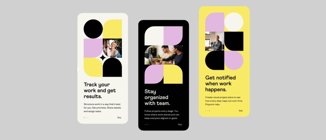
Three dimensional geometric designs are popular with start ups who want to have a cost effective way to appear avante garde without needing to spend too much on photography. 3D geometric designs use bright colors and abstract shapes that does not distract from the app’s functionality.
In 2021, we are already seeing many apps experimenting with 3d shapes to provide depth and visual interest. We expect to see it explode in 2021 as more app designers get familiar with this technique that makes elements appear to jump out of the mobile screen.
Here are some apps that can get you to think how 3D geometric designs it can be integrated into your own app. (Image Source Dribble)
4. App color schemes trends
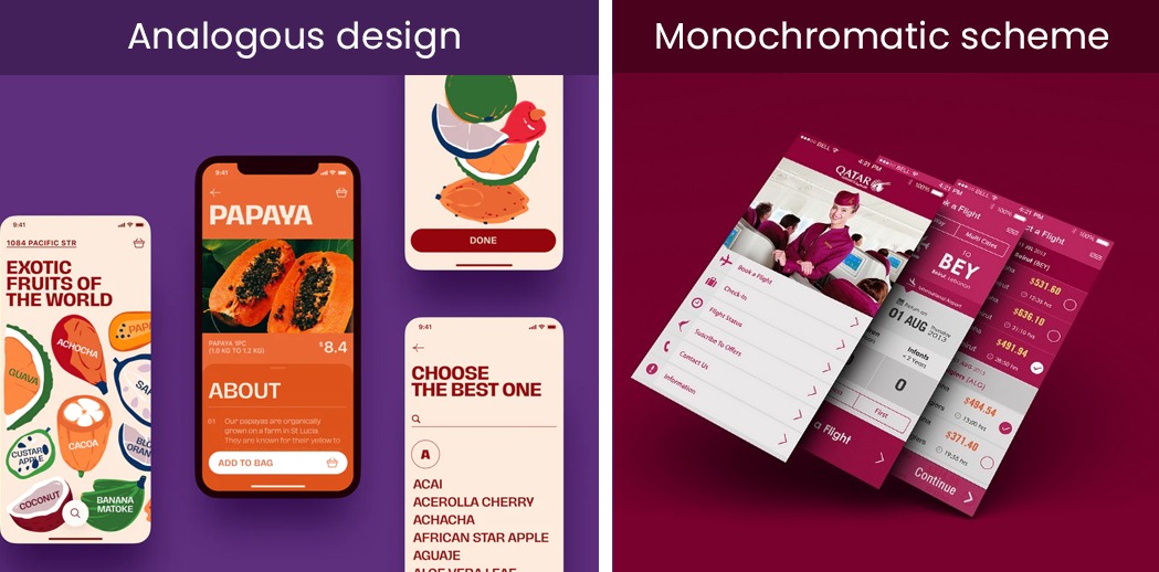
The year 2020 shook us up and this has reflected in the app color palette for 2021. Harmony is the big change and we are seeing amove towards analogous color palette. This is the use of colors that belend into one another. The advantage of this app color trend is that it is soothing to the eye. Here is what to watch out for
- Monochrome designs: App color palettes that use shades of the same color with one bold shade to make it more colorful while remaining simplistic.
- Harmony: Color schemes that use adjacent colors in the color wheel for a harmonious effect
- Cool natural colors: This app color palette is becoming more popular because of its ease on the eye
- For those who like color, the trend is for saturated, juicy colors pared with a lighter huw in the background that makes the color pop
Other Mobile App Design Trends
Other mobile app design trends like artificial intelligence, creative data visualisation, animation and an immersive experience through AR and VR, will continue to trend but the 4 trends in this article are the ones that will be applicable to all apps and are the best guidelines towards modern app design.
Design your Mobile App with iTech India
Itech India is at the forefront of developing mobile apps for a global audience with our clients spread across the world. Speak to our experts (message us on the chat) to know more about creating an enticing and product oriented app.
